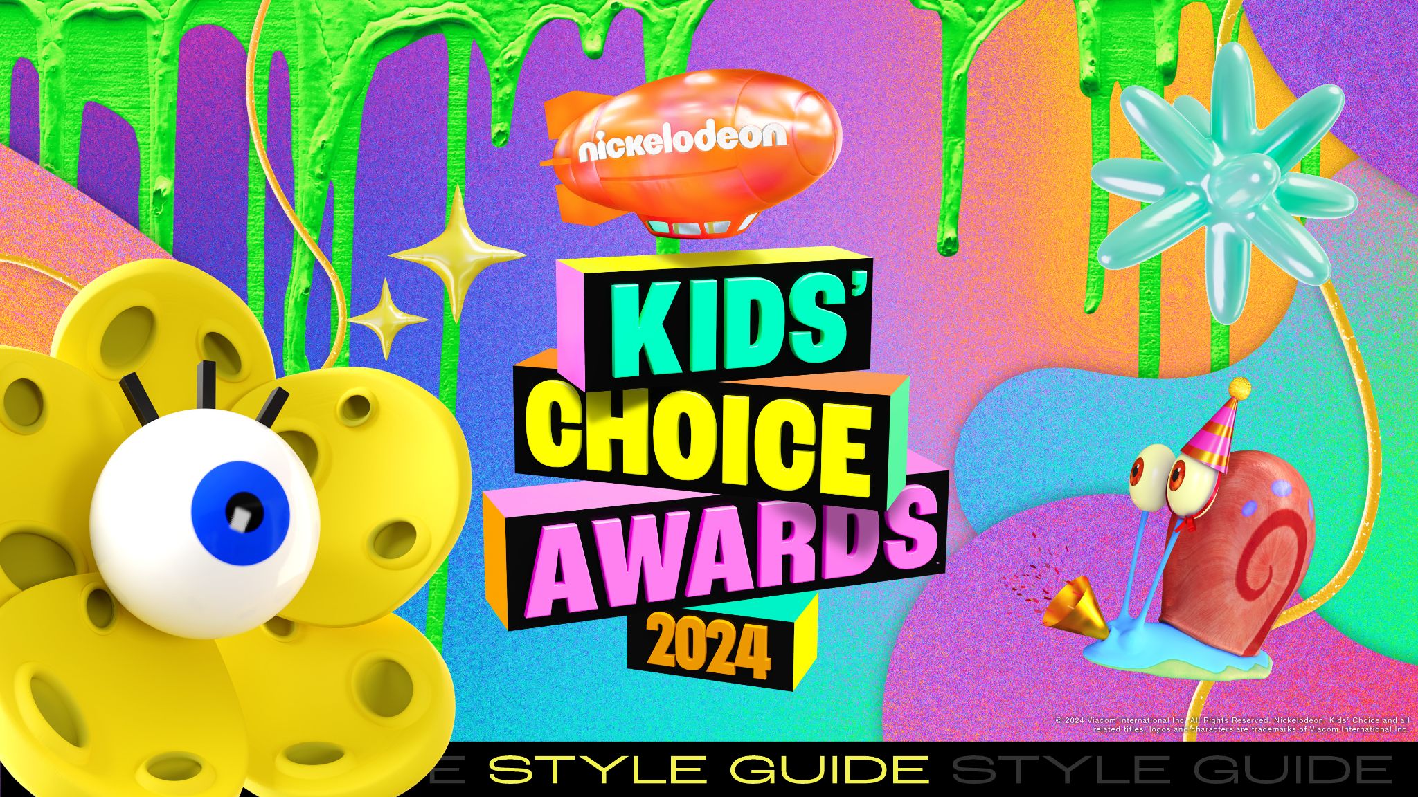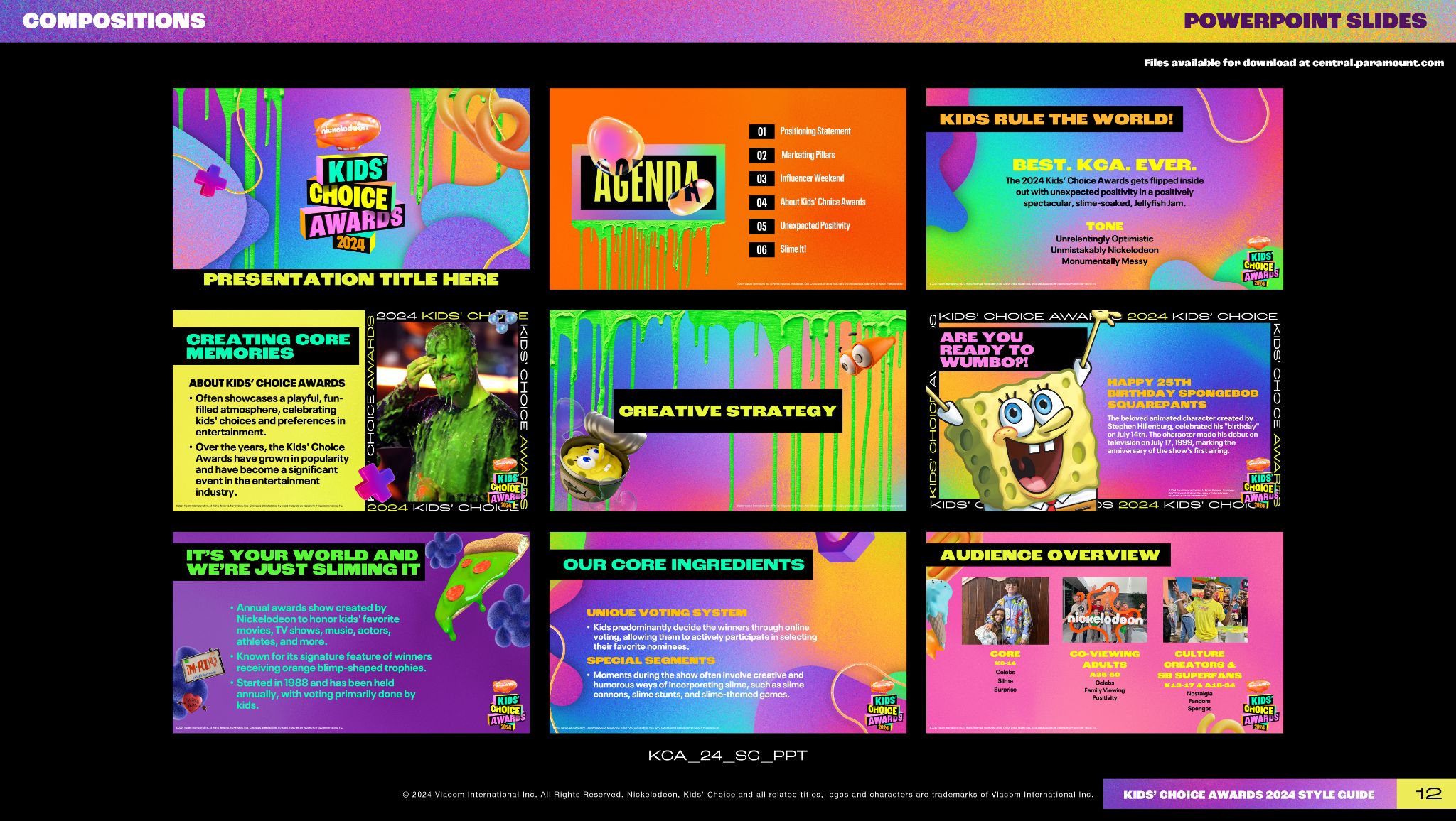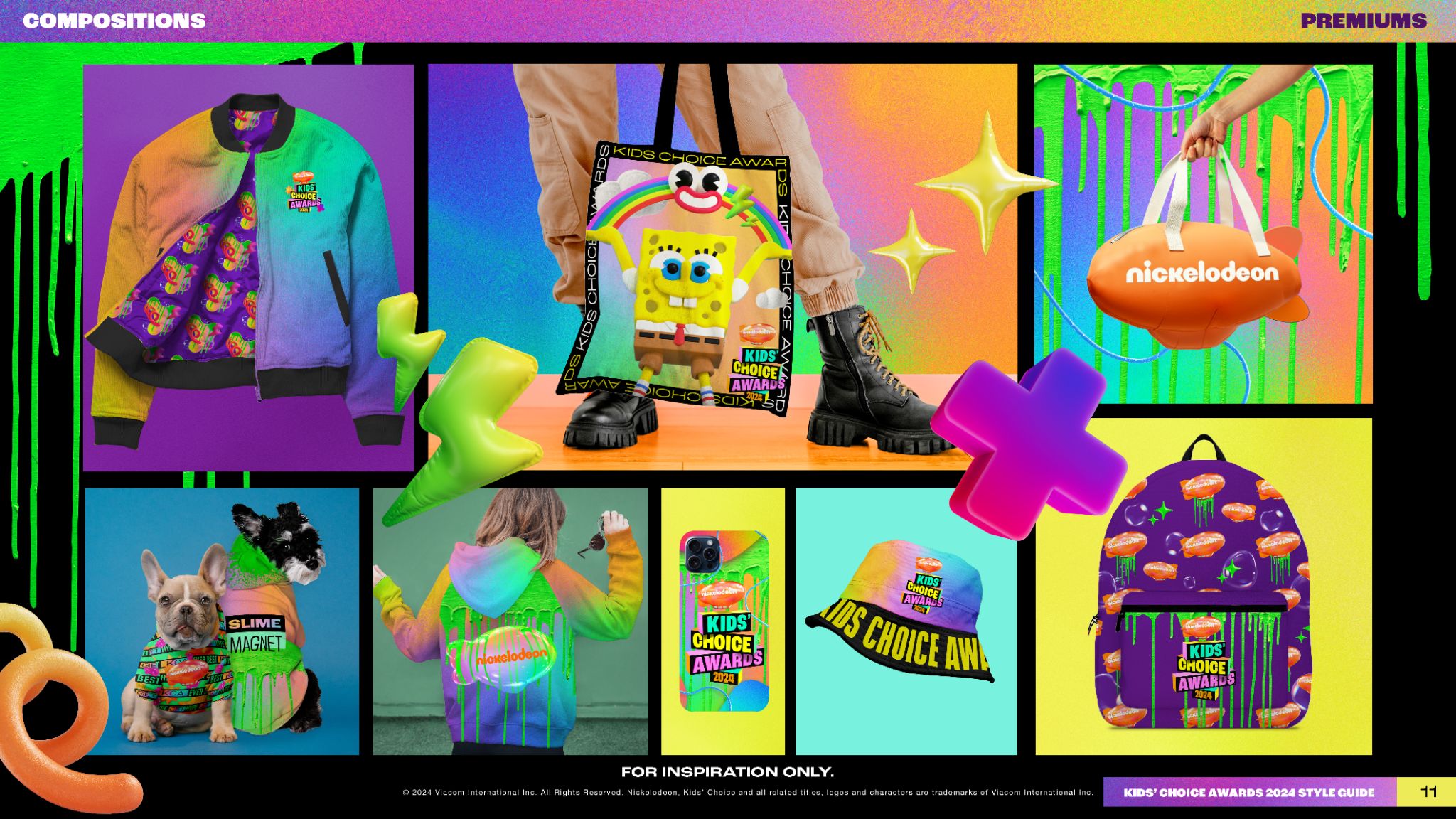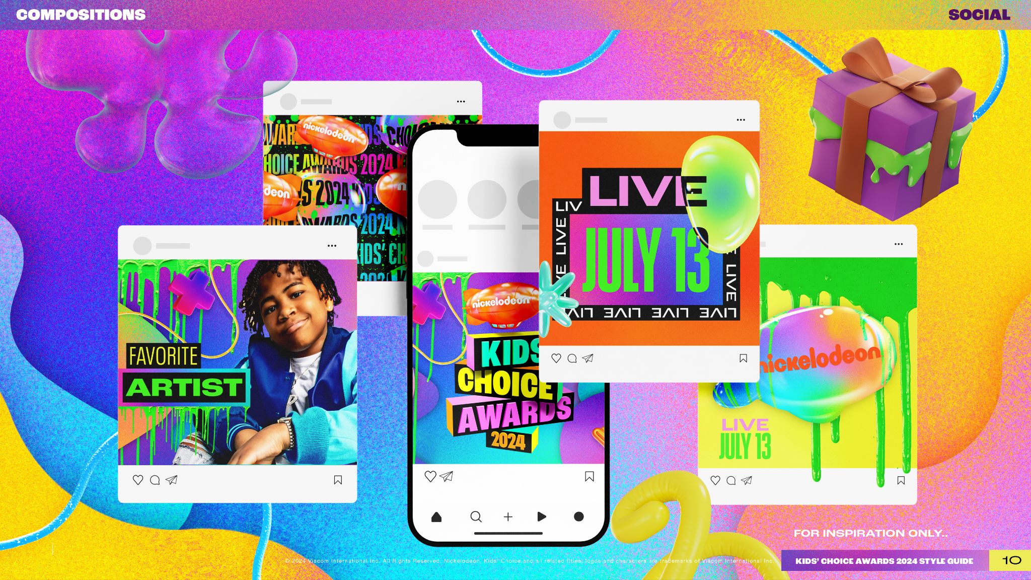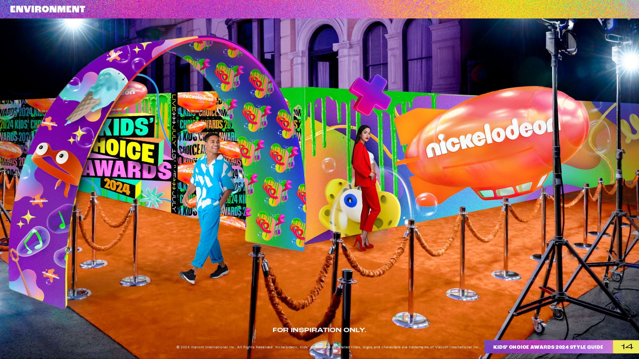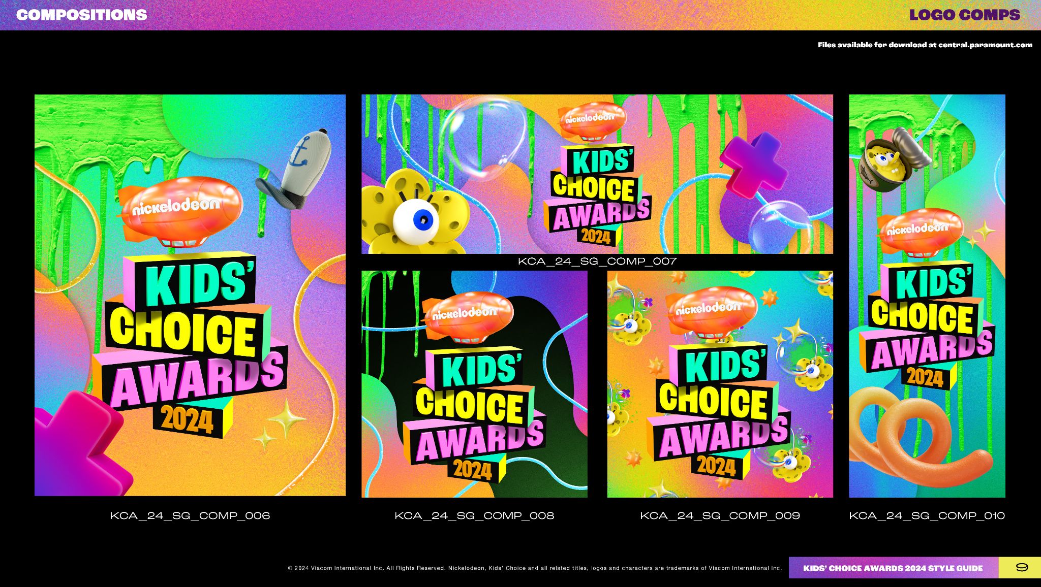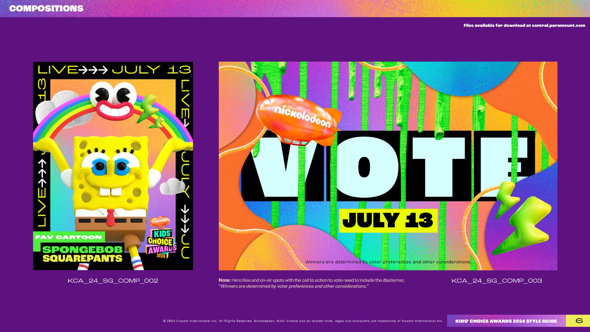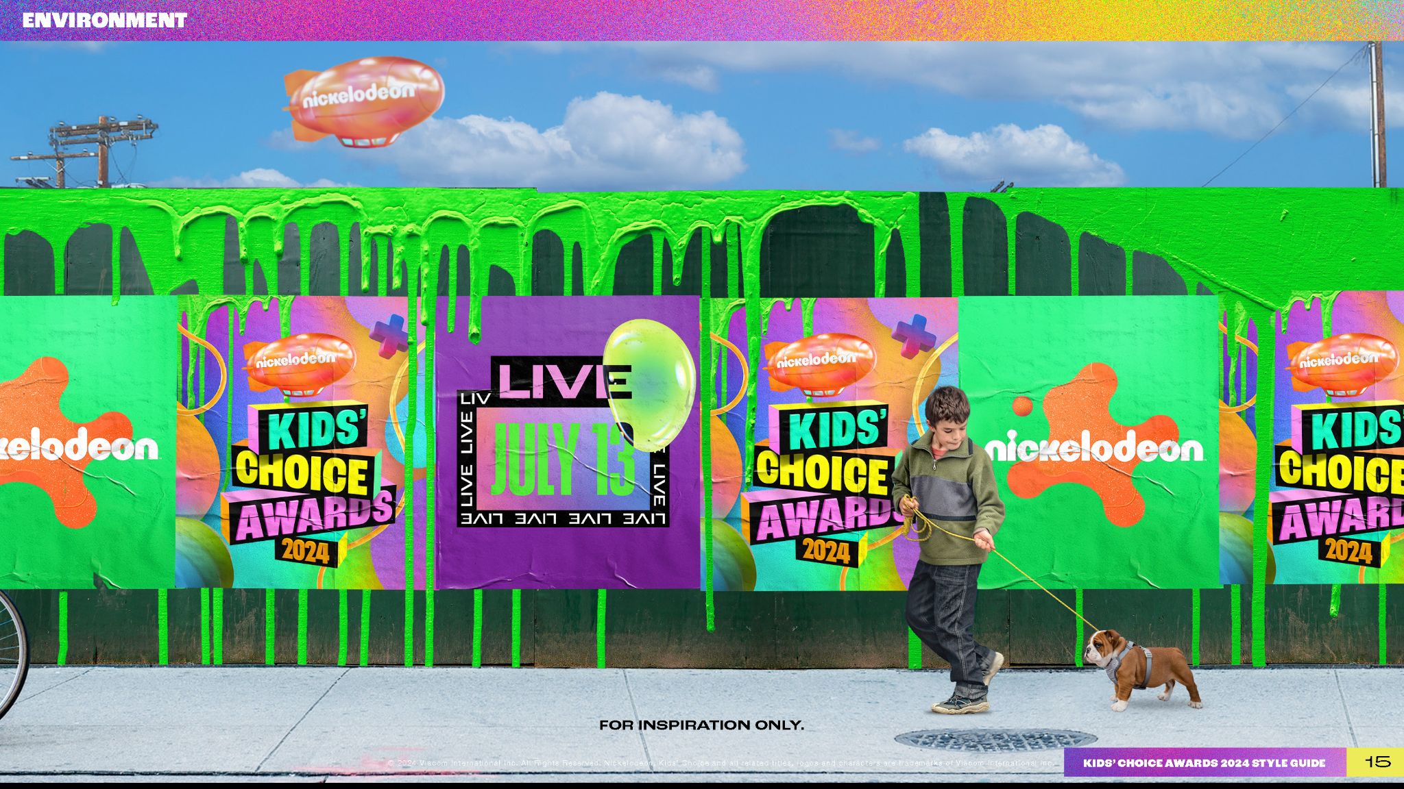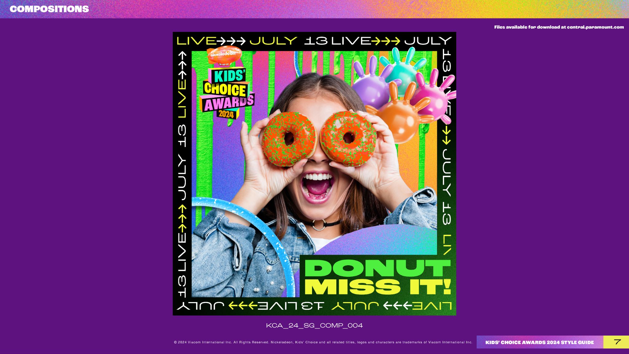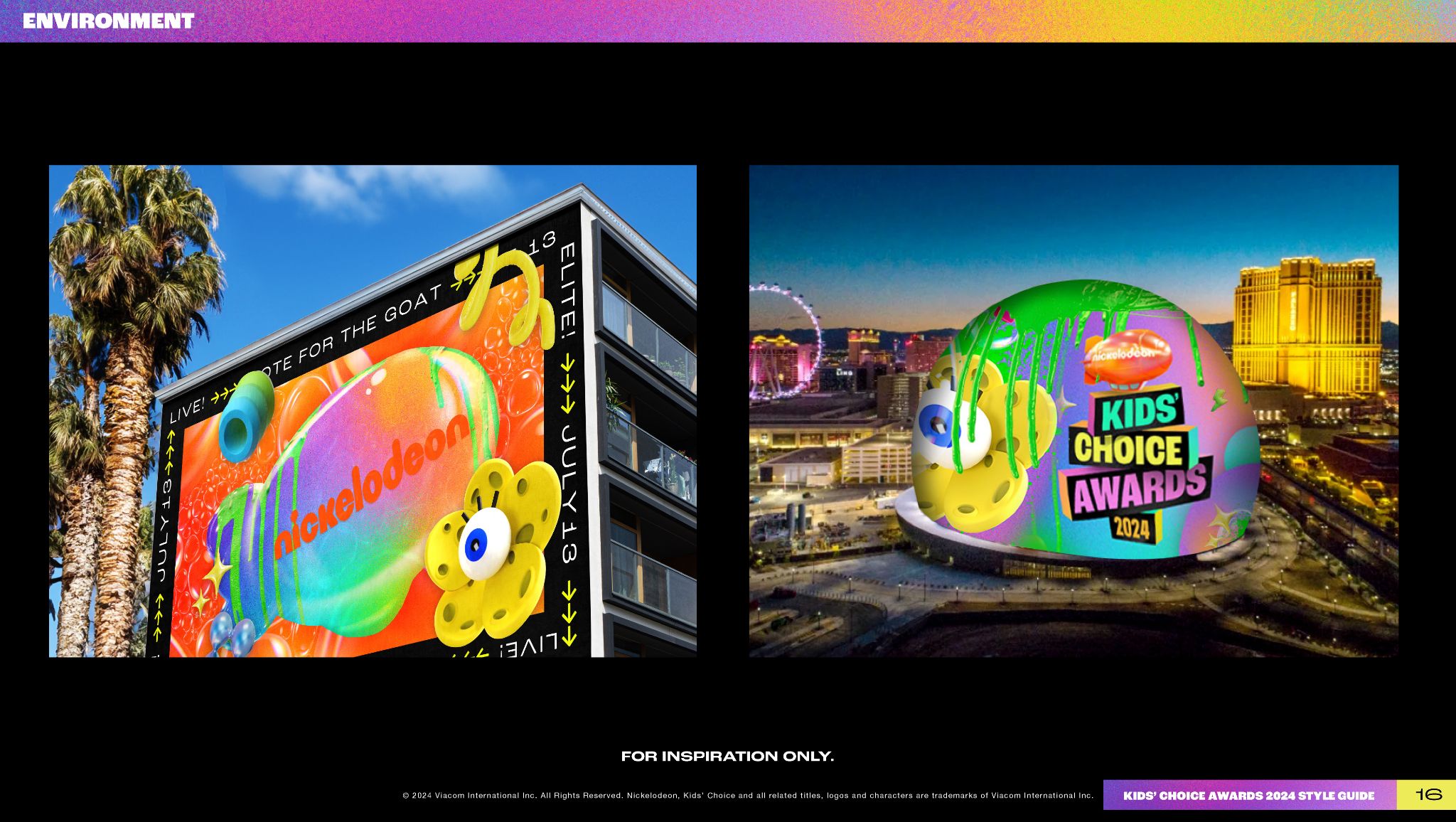
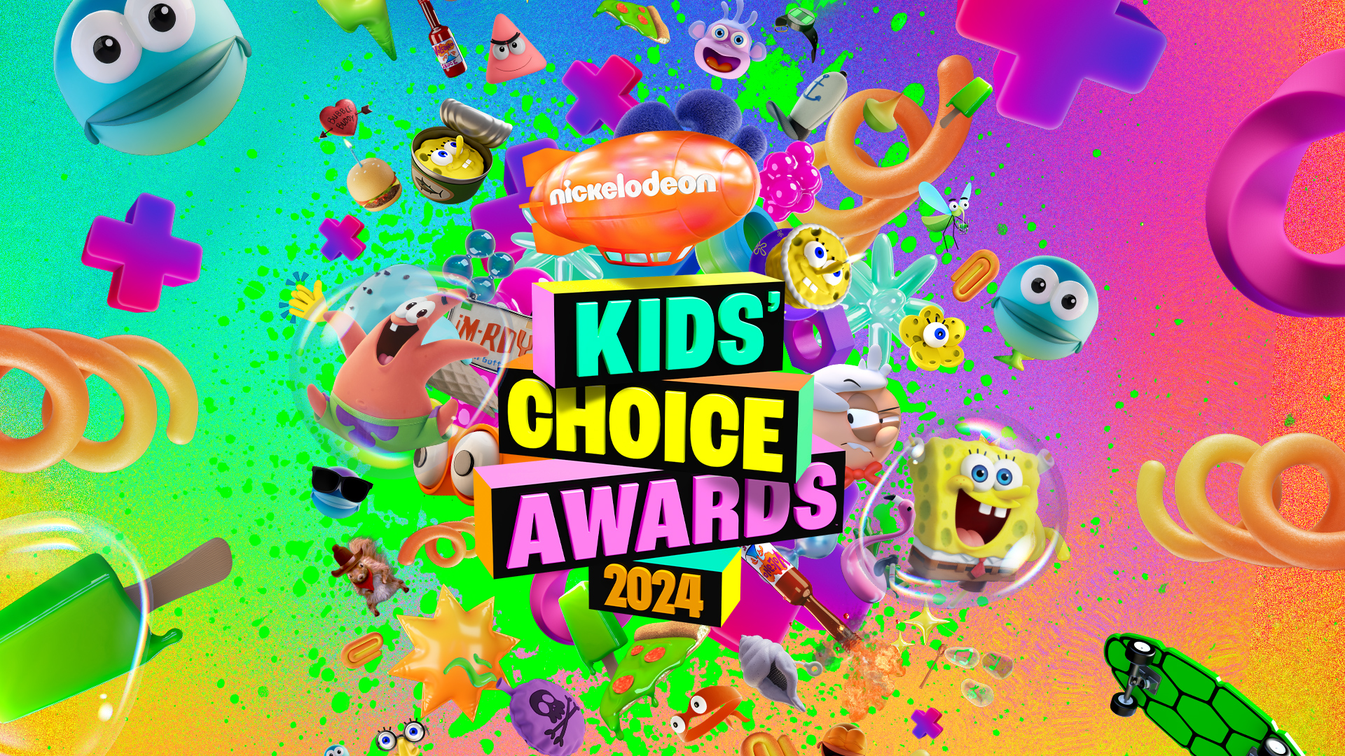
The KCA 2024 style guide started with a mood board I developed that was greenlit to move forward into full guide production. The creative brief was a specific balancing act: merge elements from SpongeBob's 25th anniversary with Nickelodeon's recently launched network rebrand, while making the result feel unmistakably KCA.
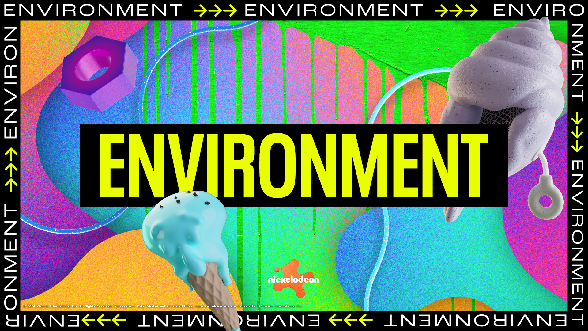
The solution leaned into what KCA does best: chaos, color, and slime. Building on the network's splat-based system, we introduced iridescent rainbow gradients, paint-drip slime textures, and bold typography, layered alongside representative character icons that tied the guide back to the anniversary. The result was a flexible visual toolkit that honored all three creative inputs without feeling like a compromise between them.
The guide was used across all Kids' Choice touch points, including key art designed by me, on-the-ground events and experiences, print collateral, and motion graphics. As a testament to its longevity, this key art continues to be used, as seen most recently at Comic-Con 2026.